Usability and accessibility, are they the same thing?
User-friendliness and accessibility go hand in hand, but focus on different aspects of digital solutions. Whereas usability focuses on an effortless, intuitive experience for everyone, accessibility focuses on ensuring that everyone can use digital environments easily and with equality. It provides a solution not only for people with disabilities, but also for people in different circumstances and with diverse needs. An example is the contrast between text and background, which is essential for people with visual impairments, but also valuable for users using the tool in brightly lit environments.
Both aspects aim to improve interaction with a digital interface, but accessibility goes further by taking into account specific requirements that are essential for a diverse user group.

Testing with the Lighthouse Accessibility Score
An effective way to quickly assess the accessibility of your website is to use Lighthouse. Lighthouse is a free tool available in Chrome DevTools that assesses your website on various accessibility criteria, among others. It checks aspects such as contrast between text and background, presence of alternative text to images, the ability to operate the site entirely with the keyboard... By reviewing this score, you gain insight into your website's strengths and weaknesses, which can help you make targeted improvements and ensure your site is accessible to a wide audience.
To generate a Lighthouse report, do as follows:
In a Chrome browser, open the web page you want to test.
Right-click anywhere on the page and select ‘Inspect’ or press Ctrl + Shift + I (for Windows) or Cmd + Option + I (for Mac)
Go to the ‘Lighthouse’ tab

Clear contrast between text and background
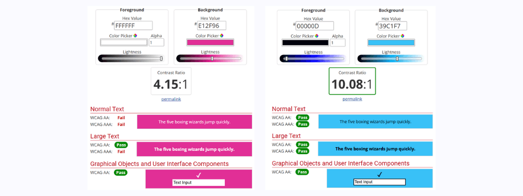
As indicated above, it is crucial for readability that there is sufficient contrast between text or icon and background colour. A useful tool to check contrast is WebAIM's contrast checker. This tool assesses contrast based on accessibility standards and indicates whether it meets the required standards for readability.
Choosing user-friendly fonts
Font choice can have a big effect on the readability of text. Avoiding thin and ornate fonts makes text more readable, especially for people with visual impairments. Sans-serif fonts such as Arial, Helvetica and Verdana are popular choices because they are easy to read. A font size of at least 16 pixels for main text ensures good readability, while headings can be displayed in a larger, eye-catching size.
Add alt text for images
Alt(ernative) texts are descriptions that represent what can be seen in an image. They are essential for screen readers as they cannot ‘read’ images, but a well-written alt text can still clearly convey the message or context.
An effective alt text describes the image briefly and clearly. Alt-texts not only help people with disabilities but also when images do not load (due to a slow internet connection, for example) and also contribute to SEO, as search engines use these texts to better understand the content of the website.
Improve keyboard accessibility
An accessible website should be fully operable by keyboard. For people who do not use a mouse, the keyboard provides the means to navigate through the website. The ‘Tab’ key is the main way to move through interactive elements such as navigation, buttons, links and input fields.
Good keyboard accessibility allows jumping from one interactive element to another and facilitates interaction with the website. The tab order should be logical and intuitive, consistent with the way the information is presented.

Adding focus colour for clear navigation
Adding a focus colour helps to show which element is currently active. For example, when a user navigates through a form using the tab key, a focus colour indicates exactly where the user is.
By providing a clear visual indication of which element is in focus, the navigation experience becomes clearer. A highly visible focus colour ensures that users can follow the logical flow of the site and do not get lost while navigating.
Maintain a consistent navigation structure
A consistent navigation structure increases accessibility and user experience for all visitors. When navigation is easy to follow and consistent across the tool, users can more easily find the information they need. This means fixed menu layouts, predictable button positions, and intuitive sequencing of content, providing users with a familiar and intuitive experience.
Forms with clear labels
A well-accessible form contains labels that describe what each field means. They are important because they provide users with context when entering their data.
It is also useful to add a placeholder to each input field. This way, you indicate to the user exactly what you expect. An input field labelled ‘E-mail address’ would then be given a placeholder such as ‘jan.peeters@domein.com’.
The placeholder is sometimes mistaken as a replacement for a label, but note that a placeholder disappears as soon as the user starts typing. This can cause confusion. Clear instructions contribute to better user experience.
Clear and descriptive link texts
Link texts play a major role in the accessibility of a website. Descriptive link texts give users and search engines a good idea of where the link leads, without having to know the context. Avoid terms like ‘Click here’ or ‘Read more’ without explanation. Descriptive link texts such as ‘View our portfolio’ or ‘Read more about our services’ offer intuitive and clear navigation through the website.
Testing with inclusive user research
Besides using tools like Lighthouse, inclusive user research is essential for creating an accessible website. This means involving people with different experience levels and physical or cognitive abilities in the testing phase.
By observing how various users navigate through the digital tool and perform different tasks, you gain insight into specific bottlenecks that may not be visible during development. This research provides valuable feedback for improvements that optimise accessibility and usability.
Accessibility is a crucial aspect of digital development that should not be overlooked. By paying attention to accessibility, we can optimise users' overall experience. At Goomyx, we are committed to making a positive social impact with our solutions, and that starts with creating inclusive and accessible platforms. By applying the tips and techniques in this blog post, you can ensure that your digital products are not only functional, but also appeal to a wide range of users.
Are you ready to make your digital solution accessible? Feel free to contact us and find out how Goomyx can help you create an inclusive digital experience.


