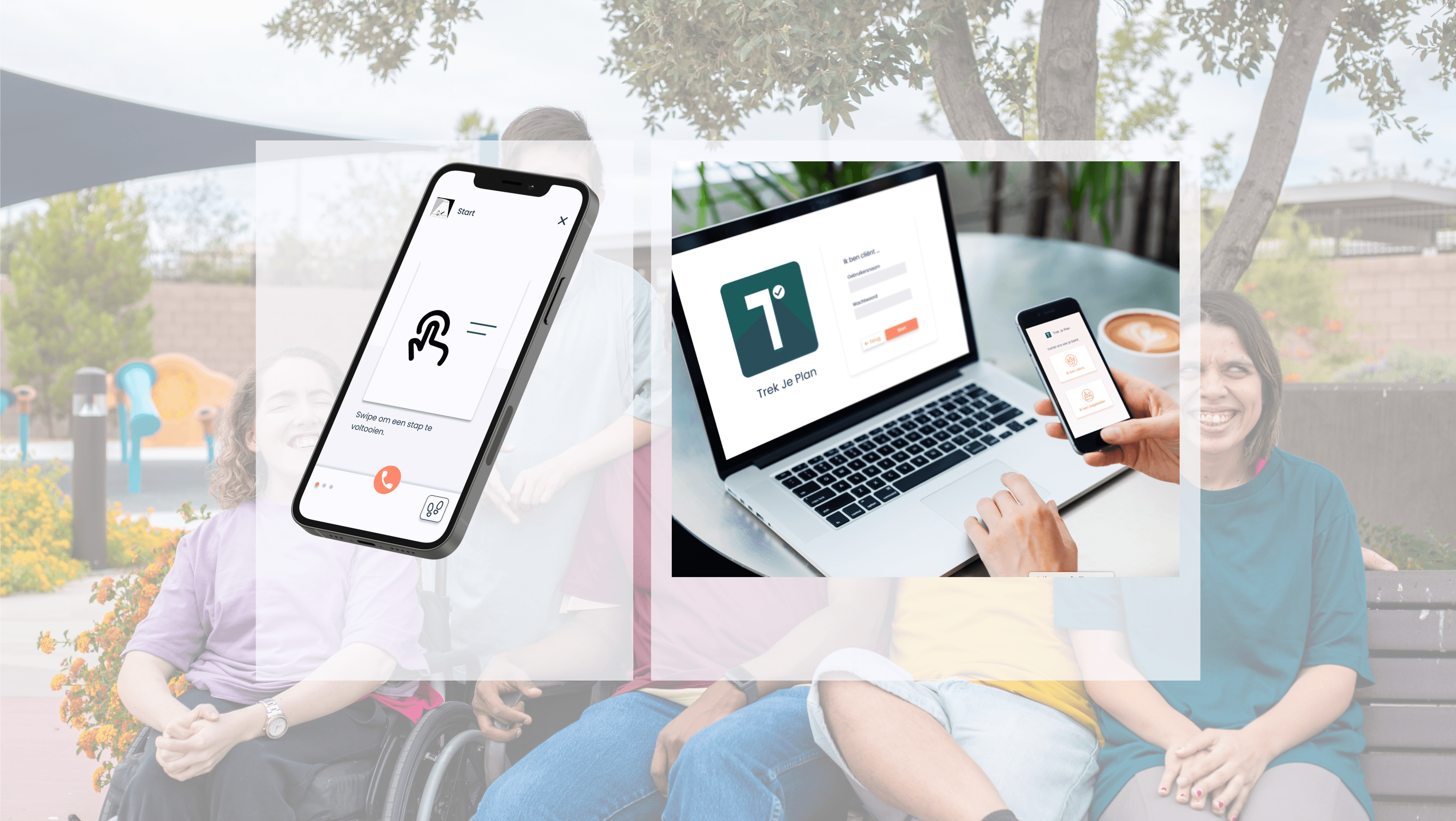
Accessible and intuitive design
One of the biggest challenges of this project was designing an appropriate interface. With the specific needs of these young people in mind, we got to work to put together a simple, user-friendly and uncluttered tool.
We opted for a muted color palette to draw attention to the content. For the same reason and because some young people cannot read or can only recognize word images, the interface consists of as little text as possible. We used the Google Font Poppins. We chose this because of its similarity to the writing style taught in Flemish schools. This helps both young people who have dyslexia and those who cannot (yet) read, but have learned to recognize word images.
A tool you can truly use anywhere
To be able to use the tool on as many different devices as possible, the design is designed mobile-first. First, we designed the screens for mobile use and then scaled them responsively. By starting from the smallest screen, we can focus the design on the core functions that should definitely be present on this small screen. Any extras can then be added in the larger screens.
For development, we started from a Progressive Web App (PWA). This way, we only had to write the code once to make the tool work on all devices: from Apple smartphones to Windows PCs. This not only speeds up the development process, it also saves some worries ánd costs, especially in the future. For example, an update can be done in one go as opposed to more traditional apps where this needs to be done per device type.

Working together for more independence
The application consists of two parts, one for the youngsters and one for the mentors to manage the step-by-step plans. A mentor can create step-by-step plans with pictures or icons. For each step there is the possibility to add word images or a short description. The pictograms have been used since childhood with youth with these needs and thus provide recognition. The steps can be planned throughout the day and repeated at desired times.
A form of gamification is added to the app in that a customized reward system can be provided based on a coin system. Upon completion of a certain step by step plan, a number of coins are earned and a reward can then be linked to that, for example screen time, snooze time, a massage, a favorite activity....
Mentors always remain a central support figure. Therefore, the app contains an easily accessible button which is always visible with a contact list.
This allows the young person to contact a mentor when they get stuck at a specific step or need some help.
Youths have their day structure nearby anywhere
When the young person opens the app for the first time, they find a ready-made plan to get acquainted with how the app works. Everything is explained at the youth's level using animations, such as: how to complete a step by swiping to the next step, how to view an overview of a step-by-step plan, and how to see which steps have already been completed and which still need to be finished.
Each day, the young person sees a chronological overview of all the step-by-step plans that need to be completed on that day.
When the user clicks on a plan, the first step becomes visible. The next step does not become visible until the previous step is completed. When all steps are completed, the youth earns coins. This is visually represented by a progress bar. When enough step plans are completed and the progress bar is completely filled in, the young person receives a reward as determined with the supervisor and the progress is reset.
Thanks to the mobile-first design, the youth can easily view all the step-by-step plans on the go, via smartphone or tablet. Learning to take the bus or run errands has never been more accessible.
Independence within reach
The proof of concept shows that IndePLANdent can provide a valuable contribution to the development of young people with (mild) intellectual disabilities and/or ASD. The app has the potential to increase their independence, motivation and self-esteem, and to help them achieve their goals.

